- Task
- Version · 6.0
- Measure
View governance and delivery dashboards
Last updated: September 29, 2026
The Operations Dashboard summarizes deployments, policy checks, and drift on one screen, and each section links through to a dashboard you can filter.
Before you begin
Contact us to enable Change Intelligence.
Your teams are reporting operations to Liquibase Secure server. Until at least one operation has been reported, the tiles have nothing to summarize.
Procedure
Open the Operations Dashboard
Sign in to the web app. You land on the Operations Dashboard, an overview of database operations, compliance, and monitoring. It is the front page of the web app, and the place to start when you do not yet know which dashboard you need.
Read what each section summarizes
Each section summarizes one category of operation and carries a View Details link to the dashboard behind it.
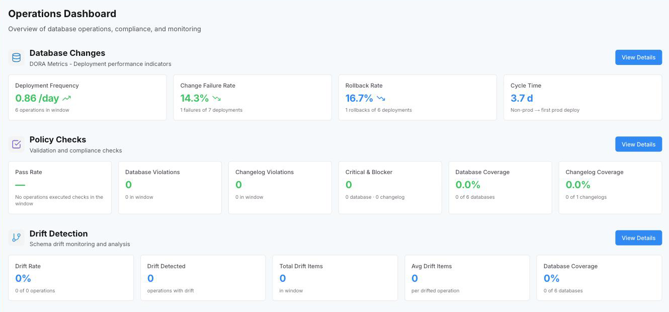
Section | What it summarizes | View Details opens |
|---|---|---|
Database Changes | How often you deploy, how often it fails, how often it is rolled back, and how long a change takes to reach production. | |
Policy Checks | How much of your estate is under policy and how often it passes. | |
Drift Detection | How widespread schema drift is across your database connections. |
Check which window each section covers
This dashboard has no time control. Each section is computed over a fixed window, and the windows are not the same length, so the numbers on this screen are not directly comparable with each other.
Section | Window on this dashboard |
|---|---|
Database Changes | The last 7 days for Deployment Frequency, Change Failure Rate, and Rollback Rate. The last 30 for Cycle Time. |
Policy Checks | The last 30 days. |
Drift Detection | The last 30 days. |
Note: Use this dashboard to decide where to look, then follow View Details to a dashboard where you can choose the time range before you compare anything.
Read a metric tile
Every tile on every measurement dashboard is built the same way, so what you learn here applies to all of them.
Every card has the same anatomy. An information icon holds the metric's full definition. A supporting line gives the counts behind the value, such as how many operations passed out of those that ran checks. An arrow compares the current window against the window before it, and is colored green when the metric moved in the desirable direction. Each card also shows the current window next to up to three earlier windows of the same length, so a value reads as a trend rather than a single number. A metric with no data in the window shows an em dash rather than a zero.
Note: The window comes from the filter bar's time range. The presets are the last 7, 30, and 90 days, plus a custom range and all time, and the default is the last 30 days. A preset produces the comparison against earlier windows. A custom or all-time range is a single window, so no comparison is shown.
Follow View Details to narrow the view
Select View Details on the section you want. The dashboard behind it adds a time range you can choose, the full filter bar, and a period comparison on every tile.
Three figures also have a trend chart there: Deployment Frequency, Change Failure Rate, and Rollback Rate, all on the Database Changes dashboard.
Note: The chart always plots the last five weeks, whichever time range you have selected, so it and the metrics above it can describe different periods. Read the chart for the shape of the trend and the metric for the number.