- Concept
- Version · 6.0
- Govern
Interpret governance and delivery measurements
Last updated: September 29, 2026
Before you change a policy or a practice, you want to know three things:
Whether your checks are catching what they should.
Whether they reach enough of your estate for that to mean anything.
Whether deployments are actually getting better.
A handful of indicators answer those questions, and they are more useful read together than one at a time. A single number tells you little on its own, so read each one against the three previous periods shown beside it on the tile.
Indicators on the Policy Checks dashboard
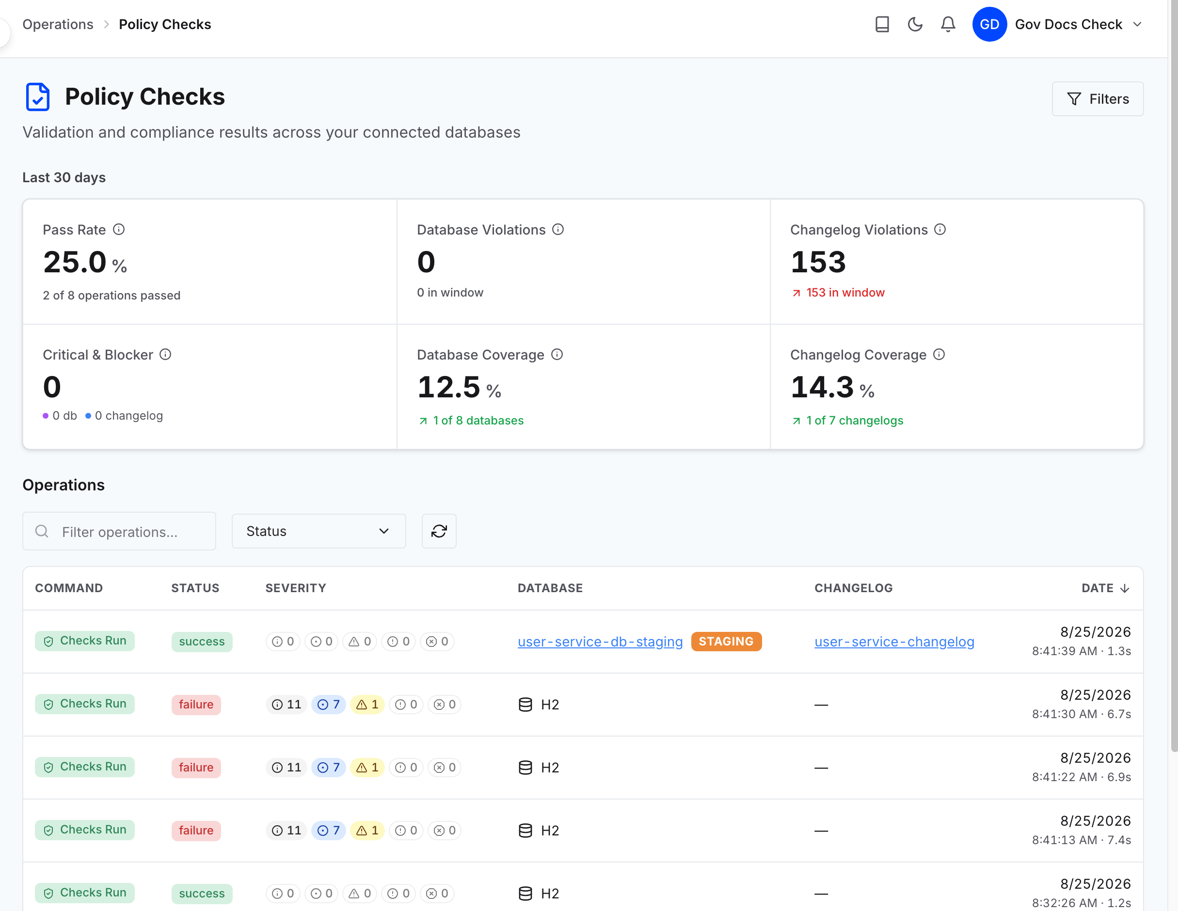
These three sit in the tile row at the top of the Policy Checks dashboard.
Pass Rate — The share of check runs that finished clean. A falling pass rate is only bad news if coverage held steady. If it fell while coverage rose, you have started checking work nobody was checking before, and the rate is telling you what was already there.
Database Violations and Changelog Violations — How much the checks are finding. A rise driven by one check across every project points at the rule itself, because it is describing work your organization actually does. A rise in a single project points at that team’s practice. Filter the dashboard to one project at a time to tell those apart, since projects are what group changelogs and connections by application, service, or team. See Compare applications, teams, and environments.
Database Coverage and Changelog Coverage — How much of the estate is being checked at all. These are what give the other two their meaning. A pass rate that improves because coverage dropped is not an improvement, and a flat violation count across shrinking coverage is not stability.
Note: A check that stops producing findings matters as much as one that spikes, because it means either the problem was fixed or the check stopped running. Nothing on this dashboard shows it, since the tiles total all checks and there is no per-check trend. To check on one rule, filter the operations list by that Check and read the dates. Recent runs with no findings mean it was fixed, and no recent runs at all mean a coverage problem. See Analyze patterns in policy failures over time.
Change Failure Rate, on the Database Changes dashboard
The fourth indicator is in the tile row at the top of the Database Changes dashboard. It is the share of deployments that failed, and it is the delivery side of the same story the policy figures tell.
Read it against the violation counts over the same window. A failure rate that falls while violation counts hold steady means enforcement is doing its job: The checks are still finding the same problems, and fewer of them are reaching a deployment. A failure rate that falls while violation counts fall too is a weaker claim, because it can also mean less was checked.
Note: Set the same time range on both dashboards before comparing them. They do not share a filter, and the Operations Dashboard summarizes the two over different windows.

What the numbers cannot say
Every one of these readings tells you where to look. None of them tells you why.
A spike does not name its cause. The same rise looks identical whether a rule is miscalibrated or your teams have genuinely started shipping riskier changes.
A flat line is not proof of safety. It means no findings where checks actually ran. The coverage figures are what tell a clean estate from an unchecked one.
A number cannot tell you what to change. That is a judgment about policy, practice, or pipeline mechanics.
When a movement matters, take it to Identify the constraint: Policy, practice, or pipeline before changing anything.